Colonial Life
Colonial Life UNUM is a forutne 500 company founded in 1939
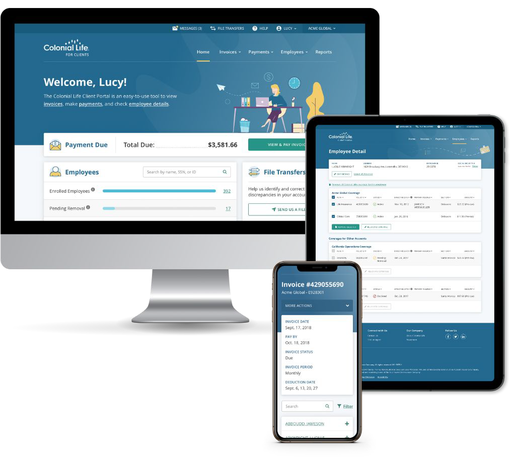
Colonial is an app that helps HR professionals manage employees. I was a designer, UXA and researcher on this project Key Demographics - 86% women, Age 40 +
The Challenge
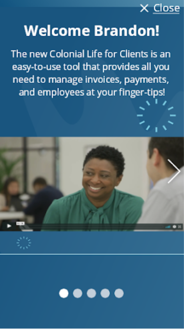
Current users needed a way to quickly learn about new features in the app. The business wanted to display new features in order to keep the customers engaged and keep them from switching to competition.They wanted it done in 2 weeks. We had a fairly large team: I was one of 3 designers on this project. The rest of the team was a project manager, project owner, five developers, a director, a business manager, a scrum manager, three testers, and a content writer.
Ideation
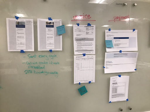
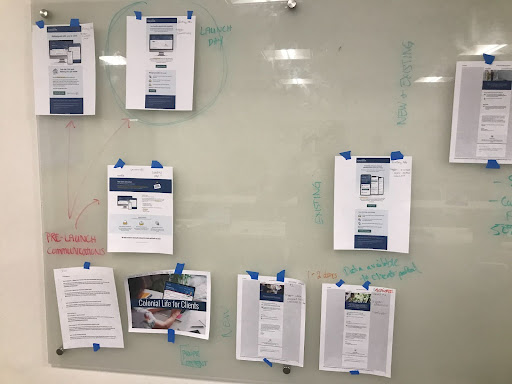
We had a few meetings where we spoke about the best way to organize the new walkthrough. This implementation would be used anytime we added a new feature.
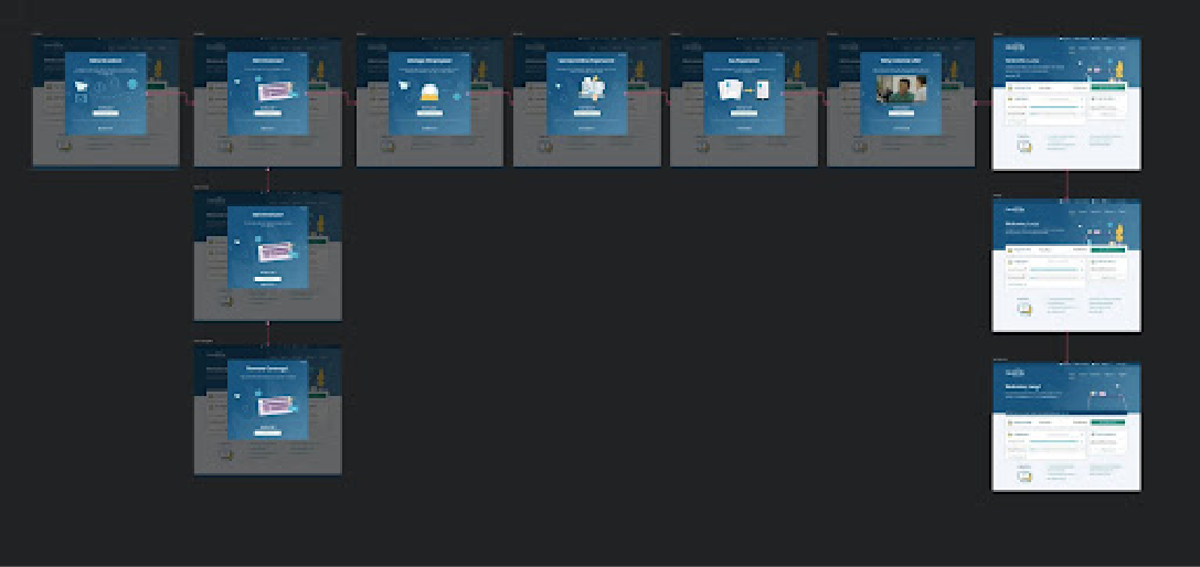
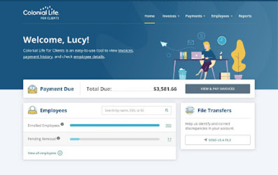
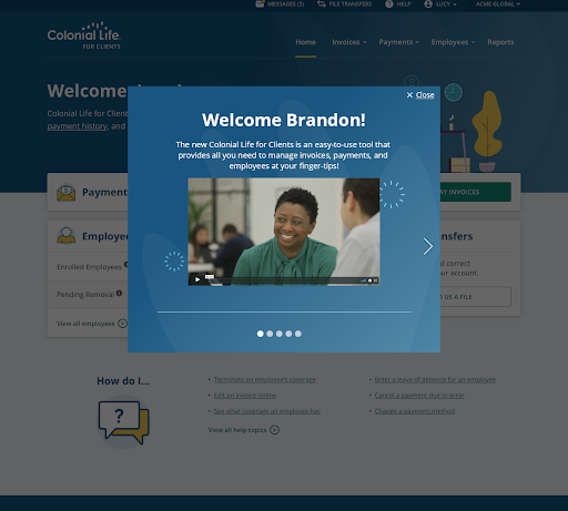
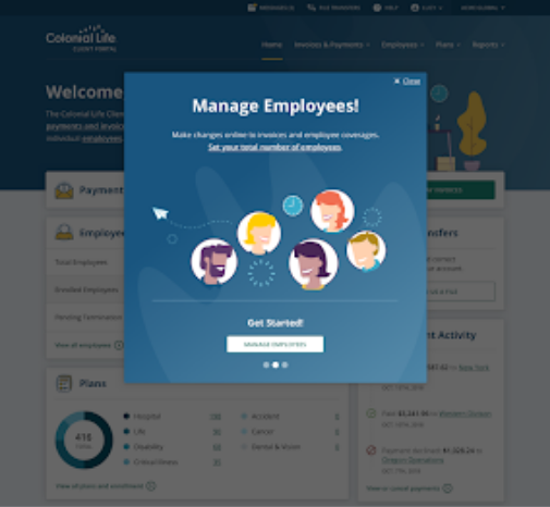
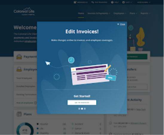
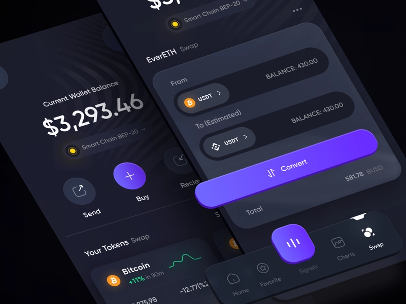
Finished Designs
The designs were completed for mobile and desktop. It was a sequential walkthrough that explained the new feature. We finished in the alloted amount of time that we were assigned by the executives.
Mobile

Desktop
User Testing
We finished on time, but then we needed to test our assumptions.
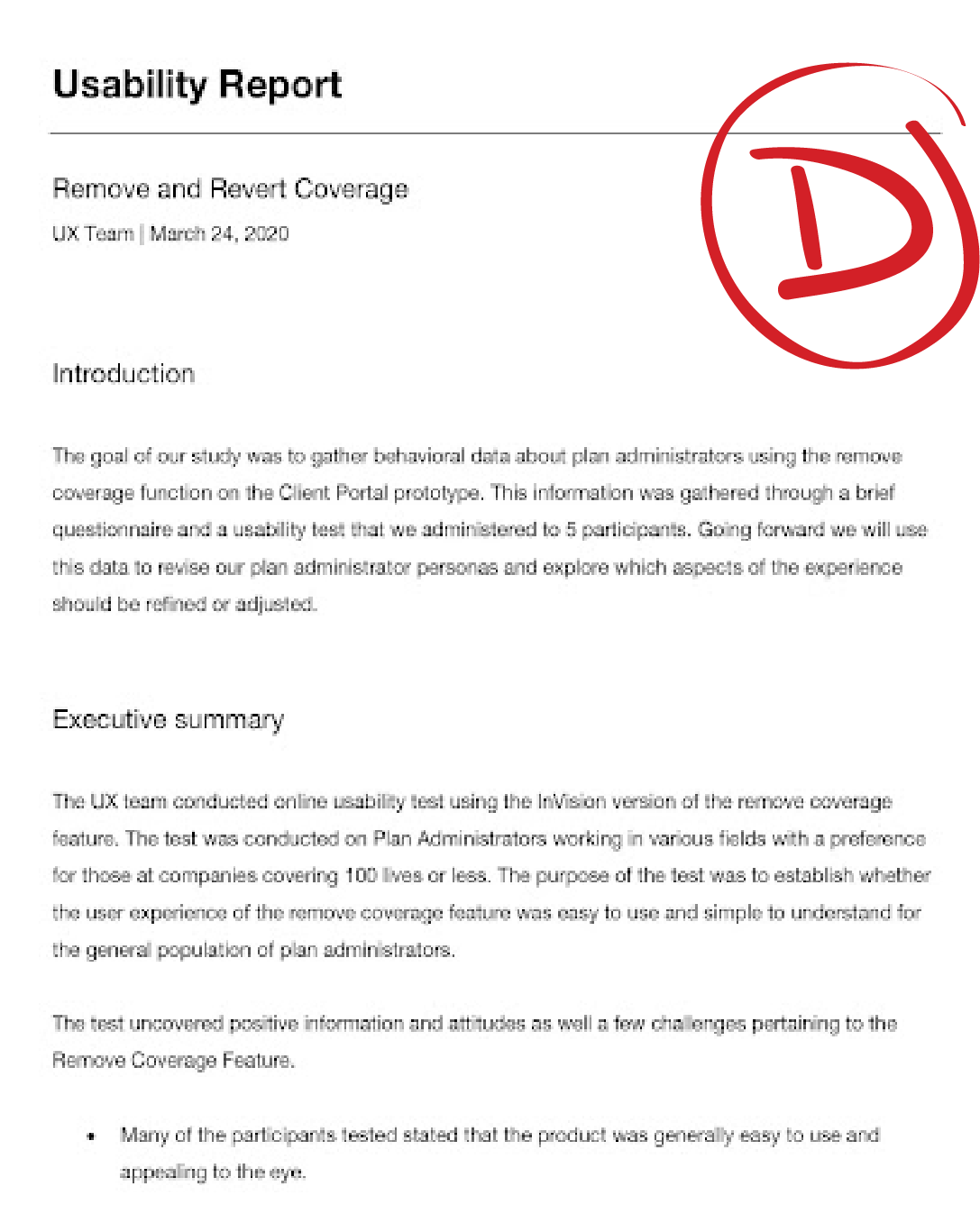
After the work was completed, we launched a test to 25 of our user to see if our new tutorial was successful. Any guesses?
Results (Not Awesome)
We purposely didn’t tell people what we were testing for and most of them closed the tutorial immediately without even looking. Instead of testing and building with the customer in mind we tested our assumptions too late with disastrous results. The is no “good UX practice” if the user never sees the experience. We tested 3 more times
Back to the *Sketch* board
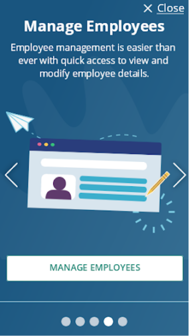
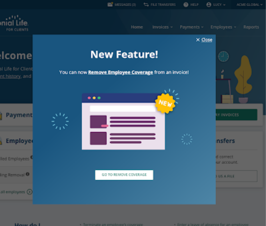
At first I thought the popup was the issue, but for the demographic, it wasn’t necessarily wrong. I solved this problem by retooling the tutorial to show only one slide about the new feature(s). New Feature(s) wording had an impact. I added a new feature icon. (Could list multiple features)
Success Metrics
The desktop redesign tested much more positively with our users and it translated to much more clicks on the tutorial button. Clicks of the button increased 92% (On Desktop).The business was happy with the change. The goal was accomplished just not in the way that they expected.
Post Mortem
What people problem are we trying to solve?
We were trying to solve a business problem and not a people problem. The two should be considered in tandem
We weren't solution agnostic--
We already had a solution in mind before fully exploring the problem.
We didn’t start with why--
We didn’t ask ourselves why we wanted to direct the user to these tutorials. We assumed all users would care about the tutorials but didn’t check to be sure it was true
If I'd done things differently...
I would have simplified even more. I felt that the large screen on mobile took up too much real estate. What if this specific user doesn’t care about the new feature? I thought it disturbed the user experience a little too much. In the end, I lost the battle, but I fought hard to get it changed.
What I learned
I learned to speak up about ideas and to think of people in tandem with business goals. Having more time for pre-planning may have helped as well.